01: Logo System
The mark that
declares everything.
The Latina Network wordmark is the primary visual expression of the brand. It is set in a warm editorial serif that is both literary and proud. The custom swash and lifted dot are the signature details that make it unmistakable. Treat it with the care it deserves.
Always do
- Use the light version on dark and Tierra Caliente backgrounds
- Use the dark version on Crema and white backgrounds
- Maintain clear space equal to the cap height of the letter "L" on all sides
- Use the logo files provided. Never recreate the mark from scratch.
- Scale the logo proportionally at all times
- Ensure the logo is always clearly legible. Minimum width 120px on screen.
Never do
- Stretch, skew, rotate, or distort the mark in any direction
- Recreate the logo in unapproved colors
- Place the logo on busy photographic backgrounds without a solid field behind it
- Add drop shadows, outlines, glows, or effects
- Use a low-resolution version where pixels are visible
- Separate "latina" from "NETWORK" as standalone elements
02: Color Palette
Five colors.
One culture.
Every color in this palette was chosen because it carries meaning from inside Latin American culture. They reference earth, sunlight, marigold altars, the Caribbean, and the warmth of every Latin American sunrise. They were not selected from a trend board. They came from the community.
Primary Pairing
Tierra Caliente on Crema. The main combination for website interfaces, documents, and print. Warm, readable, culturally rooted.
Authority Pairing
Crema on Piel Profunda. For hero sections, headers, and sponsor-facing materials where depth and authority are needed.
Celebration Pairing
Oro Suave + Agua Viva. For events, launches, milestones, and recognition. Used together, they feel like a celebration that means something.
Agua Viva Usage
Use with intention, not as default. The teal is the surprise in the palette. Reserve it for CTAs, notification accents, and celebration moments. When it appears, it should carry energy.
03: Typography
Two typefaces.
One voice.
The type system uses two typefaces: one that carries history, one that carries momentum. Together they hold the brand's dual identity: deeply rooted and always forward. Never substitute these typefaces. Never add a third.
A warm, literary serif with deep editorial roots. Its thin and thick stroke contrast communicates the brand's dual nature: strength with grace. It is the typeface of writers who have always known that the right sentence changes everything.
Light 300
Latina Network
Regular 400
Latina Network
Medium 500
Latina Network
Bold 700
Latina Network
Italic
Latina Network
A clean, warm sans-serif with strong legibility at every size. It feels contemporary without coldness. It communicates clarity and directness. It is the typeface of a Latina who says exactly what she means.
Light 300
Latina Network
Regular 400
Latina Network
Medium 500
Latina Network
SemiBold 600
Latina Network
Type Scale
Cormorant 300
56–96px
Cormorant 300
40–52px
Cormorant 300 Italic
28–40px
Outfit 500
18–22px
Outfit 300
16–18px
Outfit 500
10–12px
English
Where Latinas Lead.
Come as you are.
English is the primary platform language. All global-facing copy leads in English.
Español
Donde las Latinas Lideran.
Llega como eres.
Spanish carries equal visual weight. Never smaller, lighter, or secondary. Both languages are the brand.
04: Tagline
Two words: Latinas Lead.
Present tense. Always.
The tagline is not aspirational. It is declarative. Latinas do not need to become leaders. They already lead. The platform simply says so, plainly and without qualification.
Where Latinas Lead.
Donde las Latinas Lideran.
Use it as a declaration
The tagline closes communications, headlines moments, and anchors the brand. It always ends with a period. Never a question mark, exclamation, or ellipsis.
Both languages together
When space allows, English and Spanish always appear together. The Spanish line follows immediately beneath, at a slightly smaller scale, in Cormorant Garamond Italic.
Never alter it
"Where Latinas Can Lead" or "Where Latinas Are Leading" are not the tagline. The present tense and the absence of qualification are the entire point. Protect them.
05: Voice and Tone
The brand speaks
like a person who cares.
Latina Network has a voice that is consistent whether it is writing a homepage headline or sending a welcome email. That consistency is what trust is built from. Every writer, editor, and partner who produces words under this brand should internalize these five attributes before typing a single word.
Warm
The brand speaks like the most generous person in the room: someone who genuinely wants you to succeed and shows it in every word. Never cold, never distant, never corporate.
Declarative
The brand makes statements, not suggestions. No hedging. No qualifying. She already leads. The brand says so plainly. Present tense. Active voice. Always.
Specific
The brand names things. Colombian, not just Latina. First-gen, not just diverse. Podcast host, not just creator. Specificity is proof that the brand knows who it is talking to.
Bilingual
The brand lives in English and Spanish simultaneously. Not as translation. As the natural voice of a community that has always existed in both languages. Spanglish is welcome here.
Proud
The brand never performs its values. It simply holds them, consistently, in every interaction. The pride is quiet and absolute. It does not need to announce itself.
The Test
Before publishing anything, ask one question: would a Latina read this and feel seen, respected, and served? If the answer requires hesitation, rewrite it.
06: Vocabulary
Words we use.
Words we retire.
The specific words this brand uses and avoids are not arbitrary. Every word on the retire list has been used to diminish, flatten, or speak over Latinas in the past. The words we use treat the community as the powerful, specific, leading force they are.
We Use
- comunidadcommunity as family, not audience
- Latinasnot "Hispanic women" as default
- belongingnot "inclusion"
- creatornot "influencer"
- membernot "user"
- partnerin member-facing copy, not "sponsor"
- leadLatinas already have power; they lead
- complexityidentity is layered, not simple
We Retire
- empowerimplies we give power they don't have
- diversityas a standalone value. It is a description, not a commitment.
- girlswhen referring to adult Latinas
- Hispanicas the default. Use Latina specifically.
- safe spaceimplies fragility; we are strong
- journeyoverused and vague. Be specific instead.
- contentas the primary word. Prefer "stories" or "voice."
- multiculturalreplace with specific nationalities
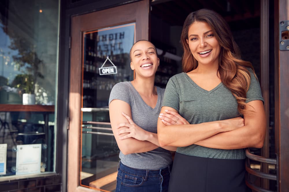
07: Imagery
Show her leading.
Always.
Every photograph under the Latina Network brand communicates one thing before the copy does: this Latina is powerful, joyful, and fully herself. The camera is never positioned above her. She is never the subject of concern. She is the subject of celebration.

Leadership
Confident posture, direct gaze, her own space
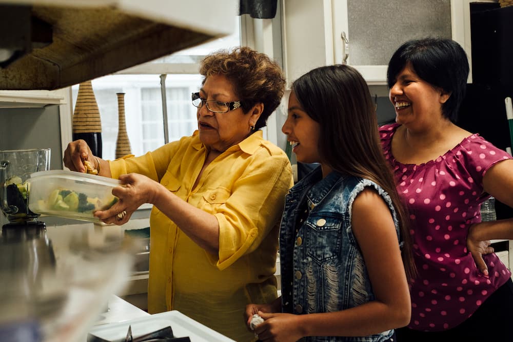
Joy and Connection
Genuine, specific, culturally alive
Building and Creating
In motion, in ownership, in her element

Heritage as Strength
Culture worn with pride, not costume

Wellness and Wholeness
Peace, not struggle. Rest, not collapse.

Professional Power
In every industry, at every level
Show
- Latinas in positions of leadership, creativity, and joy — never struggle or victimhood
- The full diaspora: Afro-Latinas, Indigenous Latinas, Caribbean, Central and South American. All represented with equal centrality.
- Real environments: homes, streets, studios, offices, markets. Not white studio backgrounds.
- Warm, natural lighting edited to lift the midtones and honor every skin tone equally
- Confident, joyful, focused, or reflective expressions. Genuine, never performed.
- Women of varying ages within the 18–45 range, representing different career stages
- Cultural symbols when authentic and specific to the individual being photographed
Avoid
- Latinas in positions of struggle, need, or victimhood
- Stereotyped visual shorthand: chili peppers, sombreros, flags as the only visual language
- Cold, blue-toned, corporate photography that could belong to any brand
- Stock photography that does not feel specific to the Latina experience
- Imagery that presents a single type of Latina as the default visual of the brand
- Heavily filtered photography that alters or diminishes skin tone
- Performative expressions or poses that feel staged rather than genuine
08: Brand Pillars
Four pillars.
One ecosystem.
Every piece of content, every community conversation, and every partnership at Latina Network lives inside one of these four pillars. They are not content categories. They are the four dimensions of a Latina's full life. Content that does not belong in at least one pillar does not belong on the platform.
01
Culture and Identity
Toda tú pertenece aquí.
Your heritage, your complexity, your whole self. Where Latina identity lives in full color, across every nationality, background, and intersection.
02
Business and Entrepreneurship
Constrúyelo aquí.
Resources, community, and the sponsored creator model for Latinas building something real. The infrastructure that finally matches their momentum.
03
Lifestyle and Wellness
Tu bienestar, a tu manera.
Wellbeing through a Latina lens. Mental health, body, family, spirituality, and the joy of living fully as yourself, without one-size-fits-all advice.
04
Media and Podcasting
Tu voz tiene un hogar aquí.
Hosting, community, sponsorship, and network amplification behind every Latina voice. Where Latina stories get the home, audience, and business they deserve.
The Brand Promise
Every Latina who encounters this brand will feel, within the first three seconds, that this was made specifically for her.
This is the standard every decision is measured against.
09: Brand Assets
Files ready
for every use.
All brand assets are available from the Latina Network brand team. When in doubt about which file to use, contact the platform directly. Never recreate brand elements from screenshots or low-resolution previews.
Logo Files
Light and dark versions in PNG (high-res) and SVG (vector). Includes horizontal, stacked, and icon-only variants.
PNG · SVG · Available from brand teamColor Swatches
All five brand colors in ASE (Adobe Swatch Exchange), HEX reference sheet, and Pantone equivalents for print production.
ASE · PDF · Available from brand teamBrand Guidelines PDF
This complete brand guidelines document in print-ready PDF format for sharing with vendors, designers, and partners.
PDF · Available from brand teamTypography Files
Cormorant Garamond and Outfit font files, with licensing documentation for web and print use.
TTF · WOFF2 · Via Google FontsPhoto Library
Approved brand photography featuring Latina creators and community members, cleared for all platform use.
JPG · Available from brand teamBrand Voice Guide
The complete voice, tone, vocabulary, and copy guidelines in a standalone reference document for writers and editors.
PDF · Available from brand teamQuestions about brand usage?
Every brand decision should serve
the community first.